Most people today spend more time browsing on their phones than on any other device. While responsive design adjusts a desktop layout to fit smaller screens, mobile-first design starts with mobile as the foundation. This means creating a site specifically for quick taps, easy scrolling, and fast loading from the very beginning. At Web Theoria, we go beyond simply making sites mobile-friendly; we design them to give mobile users the best experience possible. For businesses in Cyprus, where mobile traffic is on the rise, this approach helps you stay connected with your audience wherever they browse.
Mobile-First Design vs Responsive Design
Step-By-Step
Building Your Mobile-First Website
Our Process for Creating a Mobile-Friendly, High-Performance Site
Real Results from Mobile-First Design
At Web Theoria, mobile-first design is a strategic approach we recommend when performance and usability on smaller screens are a priority. While not required for every project, it often delivers significant value in speed, user experience, and SEO.
Consider these three distinct implementations:
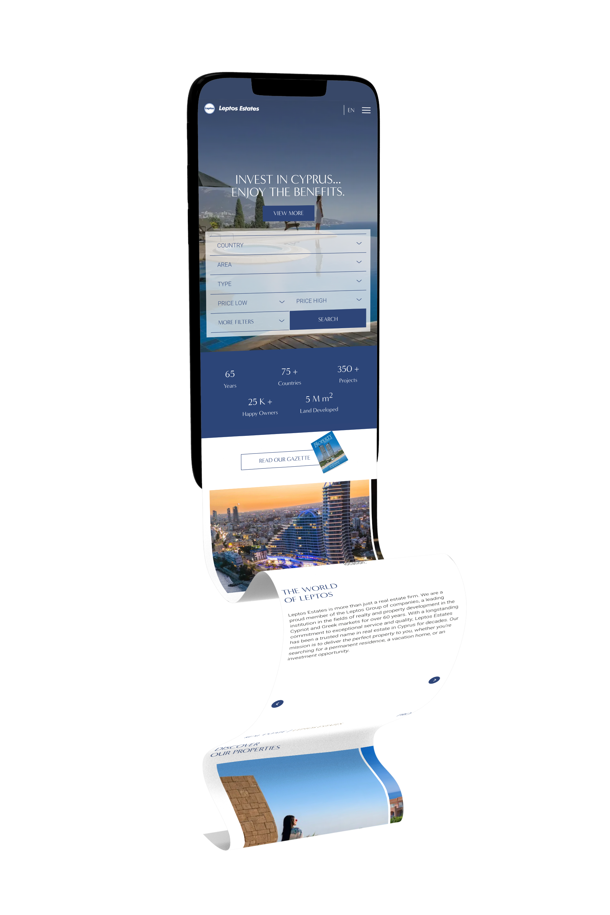
With Leptos Estates, our collaboration and specific SEO requirements led to the decision to adopt a mobile-first design and development approach. This allowed more than 450 pages and over 350 properties to load significantly faster on mobile devices.
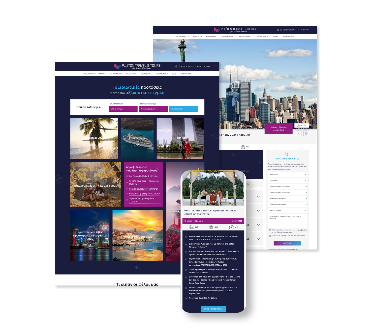
For Pluton Travel & Tours, the client opted for a mobile-first design to meet SEO goals and ensure optimal loading speeds, given the website’s rich visual content. With hundreds of travel packages, nearly 700 user testimonials, and extensive use of photos and videos, it was essential to prioritise performance on mobile. The result is a fully optimised platform seamlessly connected to Instagram for increased engagement and visibility.
For AAL Shipping, a global maritime operator, speed and functionality were key priorities. We developed a dynamic, responsive website featuring interactive route maps, an office locator, and rich cargo galleries—all designed with mobile usability in mind. This approach not only ensured smooth navigation and fast performance across devices but also contributed significantly to improved SEO results.
These projects show how mobile-first design elevates usability, boosts SEO, and delivers measurable business value.
Mobile First Design
Why Your Business Needs
Mobile-First Design
Designing with mobile in mind means more than just fitting a site to a smaller screen. It’s about creating a smooth, fast experience that meets the needs of today’s mobile users and keeps your site competitive in search rankings.
Here’s how mobile-first design can make a difference for your website:
SEO Boost
Google uses the mobile version of your site to rank it, so mobile-first design improves visibility and attracts more visitors.
where first impressions matter most: on mobile.
Fast Loading
Mobile-first design focuses on speed, optimizing images and code to keep load times short, which improves user satisfaction and search rankings.
User Engagement
An intuitive, touch-friendly design keeps visitors on your site longer, leading to more interaction and conversions.
Reduced Bounce Rates
A smooth, fast site experience reduces bounce rates, encouraging users to stay and explore your content.
Competitive Edge
A mobile-optimized site shows your brand is modern and accessible, helping you stand out in a mobile-driven world.
Mobile first Breakdown
Speed and User Experience Why Fast Matters
A slow website can drive visitors away in seconds. With mobile-first design, speed is at the core, creating a seamless experience that keeps users on your site and improves search engine rankings. Here’s how Web Theoria prioritizes speed and smooth browsing from the ground up.
Speed Matters
- If your site isn’t fast, visitors won’t stick around. We make sure your site loads quickly from the start.

Optimized Images
- Large images slow things down. We compress them, keeping quality high and load times short.

Lazy Loading
- Images and videos load only when needed, saving data and boosting speed for smoother browsing.

Simple Code
- Excess code slows performance. We keep it clean and efficient for a faster, smoother site.

SEO Boost
- A fast site ranks higher. Google rewards quick-loading sites, helping you stay competitive.

User Engagement
- Speed keeps users happy, encouraging them to explore your site and stay engaged longer.
The Power of Mobile-First Design
why mobile-first design matters
Mobile-first design ensures websites are intuitive and easy to navigate. At Web Theoria, we create user experiences that let visitors find what they need effortlessly, using clean layouts and touch-friendly buttons.
This approach enhances accessibility, reaching users on any device. For businesses in Cyprus, it means connecting with both local and global audiences, building trust, and encouraging repeat visits.
Frequently Asked Questions
FAQs on Mobile-First Design
What does mobile-first mean in web design?
1
Mobile-first means designing your site with mobile devices in mind before adapting it for desktops. It ensures the site performs seamlessly on mobile screens, enhancing user experience and search engine rankings.
How does a mobile-first site benefit my SEO?
2
Google’s mobile-first indexing makes the mobile version of your site the primary version considered for rankings. A well-designed mobile site loads faster, reduces bounce rates, and keeps users engaged—all factors that positively impact SEO.
Is mobile-first design suitable for all businesses?
3
While it may not seem necessary for every business, a mobile-first design is beneficial across industries. With the majority of web traffic coming from mobile devices, a mobile-first approach ensures your site is accessible, responsive, and future-proof.
Will a mobile-first design increase my site’s development costs?
4
Mobile-first design requires extra attention and detail, increasing initial costs up to 30%. However, it’s an investment that pays off through improved SEO, better user experience, and higher conversions, making it well worth the cost.
Will my mobile-first website still work well on desktops?
5
Yes. Mobile-first design doesn’t mean ignoring desktops—it ensures that your site performs seamlessly across all devices, offering a consistent user experience on mobile, tablets, and desktops.
How often should I update my mobile-first website?
6
Regular updates are crucial to maintain speed, functionality, and SEO performance. Reviewing loading times, mobile usability, and Google’s ranking factors at least every 6-12 months helps keep your site optimized.


